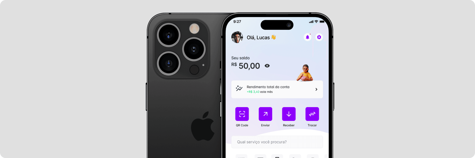
Lovepay App: Connecting People Through Payments - A Journey From My Internship
Lovepay App is a finance app created to facilitate digital payments between Brazil, Cape Verde and Portugal. Mainly focused on social interaction and independent payments for p2p and international payments.
🏭 Industry: Finance
📱 Application Format: - Mobile
⌛️ Time Frame: August 2022 - September 2023
👩🏼💻 Team: 1 Senior Designer, 1 Junior Designer (me) and 2 Developers
🌎 Work Model: Remote - Design Team: Daily meetings / Whole Team: Weekly meetings
Thinking back on my time as an intern and junior product designer at a startup, it was a rollercoaster of learning and growth. I dabbled in visual design, marketing, and product development, wearing many hats as we hustled to make things happen.
We operated on shoestring budgets and tight timelines, but I embraced the challenge, soaking up every lesson along the way. It was tough, but it was also incredibly rewarding. I learned how to adapt, how to problem-solve, and how to thrive in a fast-paced environment.
Tailored Insights: Navigating Project Engagement for Busy Readers
Recognizing the busy nature of the reader, two distinct pathways are offered:
- The project in a nutshell provides a quick, high-level overview tailored for efficiency.
- The project in depth caters to those with a bit more time and curiosity, offering a detailed exploration.
1. This project in a nutshell
For methodology, I used an adaptation of the Double Diamond (Discover, Define, Develop, and Deliver).
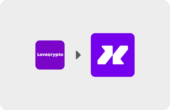
Transitioning from Lovecrypto Pay to Lovepay App: Why We're Making the Change
The Lovecrypto Pay was the first app of the company and it facilitates cryptocurrency conversions to Brazilian reais, predominantly through a partnership with Impact Market for financial inclusion. Despite innovative DeFi technology, the platform faces challenges including a small user base and limited engagement. Users also struggle with complex currency conversions, hampering financial flexibility. Developing a new application aims to retain existing users and attract new ones from regions like Brazil, Cape Verde and Portugal, meeting the shared need for convenient international transfers and advancing financial inclusivity.
So, what problem are we trying to solve?
Convenient and cost-effective international transfers, especially for immigrants between Brazil, Cape Verde and Portugal.
Tools:
Exploratory Research
Qualitative Research
2. This project in depth
The design process I chose followed a framework from Artiom Dashinsky's book, "Solving Product Design Exercises." This framework breaks the design steps into Why, Who, What, and How, which helped me follow stakeholder guidance and stay organized in this case study.
Why: Diverge into the problem
Transitioning from Lovecrypto Pay to Lovepay App: Why We're Making the Change
Tools:
Exploratory Research
Qualitative Research
From Lovecrypto Pay...
The Lovecrypto Pay was the first app of the company and it serves as a platform for converting and withdrawing cryptocurrencies into Brazilian reais. The majority of users come from a partnership with Impact Market - a human empowerment protocol that uses DeFi to drive financial and educational inclusion. Brazil is one of the countries in the pilot program, where beneficiaries receive financial assistance in Celo Dollars (cUSD) and convert and withdraw using the Lovecrypto App platform.
Despite leveraging innovative DeFi technology, the platform struggles with challenges including a smaller user base, subdued engagement levels, and low value transactions.
...To Lovepay App
Considering these hurdles, the proposition of developing a new application emerges. Such a move aims not only to retain existing users, who are drawn to the social impact aspect of the platform, but also to attract new users from regions with less developed digital financial infrastructures, such as Cape Verde and Portugal.The linkages between these countries, coupled with linguistic similarities, highlight a shared need among immigrants for a convenient and cost-effective means of conducting international transfers.
⚙️ What problem are we trying to solve?
Convenient and cost-effective international transfers, especially for immigrants between Brazil, Cape Verde and Portugal.
🌎 What impact does it have on the world?
Enhancing financial inclusivity globally, especially in regions with less developed digital financial infrastructures.
👥 How does this product benefit customers?
Offering an easy-to-use platform for cryptocurrency conversions, improving financial flexibility and simplifying international transfers for users residing between the 3 countries.
💼 What business opportunities does it creates?
Expanding user base, increasing transaction volumes, attracting partnerships, and investments for sustained growth.
💡 How does it extend the company's mission?
Advancing the company's mission of driving financial and educational inclusion through innovative technology solutions, thereby contributing to a more equitable global financial landscape.
Who: Converge in the area of focus
What are the categories of people who have significantly different motivations for using this product?
Tools:
Qualitative Research
User Interview
Personas
Expanding User Base: Targeting Portuguese-Speaking Immigrants Abroad
One of our biggest problems with the first app was the limited user base. To resolve this situation, we intend to adapt our product to a new type of user: Brazilians, Portuguese and Cape Verdeans living abroad who need to make/receive transfers. We chose these three countries based on the language (they all speak Portuguese) and also because Portugal and Cape Verde have the least evolved digital banking system. We started with research to get an idea of the number of immigrants in each country.
400.759 🇧🇷 Brazilians in 🇵🇹 Portugal (2023)
218.000 🇵🇹 Portuguese in 🇧🇷 Brazil (2023)
34.093 🇨🇻 Cape Verdeans in 🇵🇹 Portugal (2021)
4.528 🇨🇻 Cape Verdeans in 🇧🇷 Brazil (2020)
2.000 🇵🇹 Portuguese in 🇨🇻 Cape Verde
Insights from Cape Verdean Students: Challenges with International Transfers
To understand this better, we interviewed a student from Cape Verde in Brazil. Many Cape Verdeans, like him, get scholarships but still rely on family transfers to support themselves in Brazil. We asked questions about the interviewee's habits and lifestyle, products they currently use for transfers, good and bad experiences with these products, and Cape Verde's banking system. We found that international transfers take too long and come with high fees, especially in areas with limited digital banking like Cape Verde.
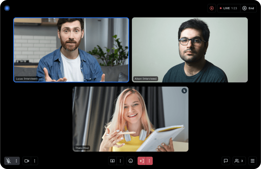
The images are illustrative
Creating Diverse User Personas
To better understand who will use our product, I created personas based on previous research data. The audience is diverse, so I developed different persona groups, totaling five:
- Graduate Students (master's, doctoral, enhancing qualifications)
- Property Investors
- Skilled Workers (digital nomads, IT professionals)
- Unskilled Workers
- Existing Beneficiaries from Lovecrypto App
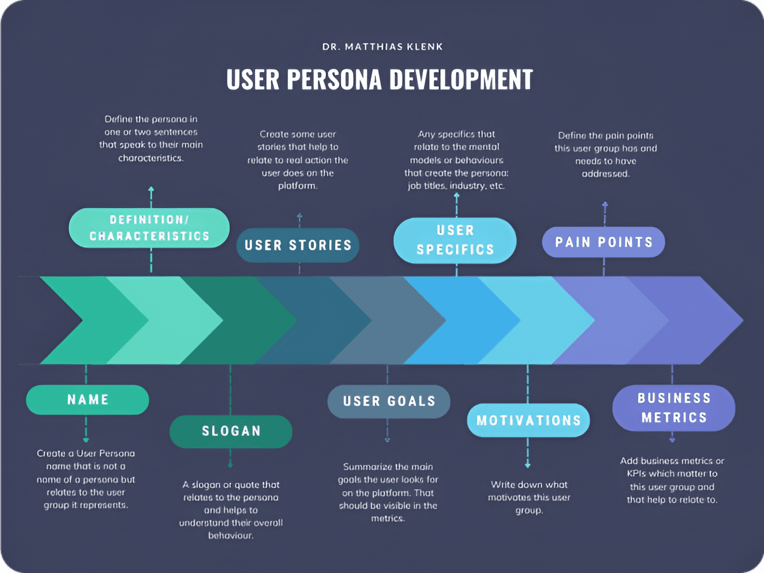
User Persona Framework by Dr. Matthias Klenk that I've utilized
How: Diverge in potencial solutions
Exploring Solutions: Stakeholder and User Perspectives, Market Analysis, and Competitor Weaknesses
Tools:
Competitive Analysis
Benchmark
Competitive Analysis: Identifying Market Gaps
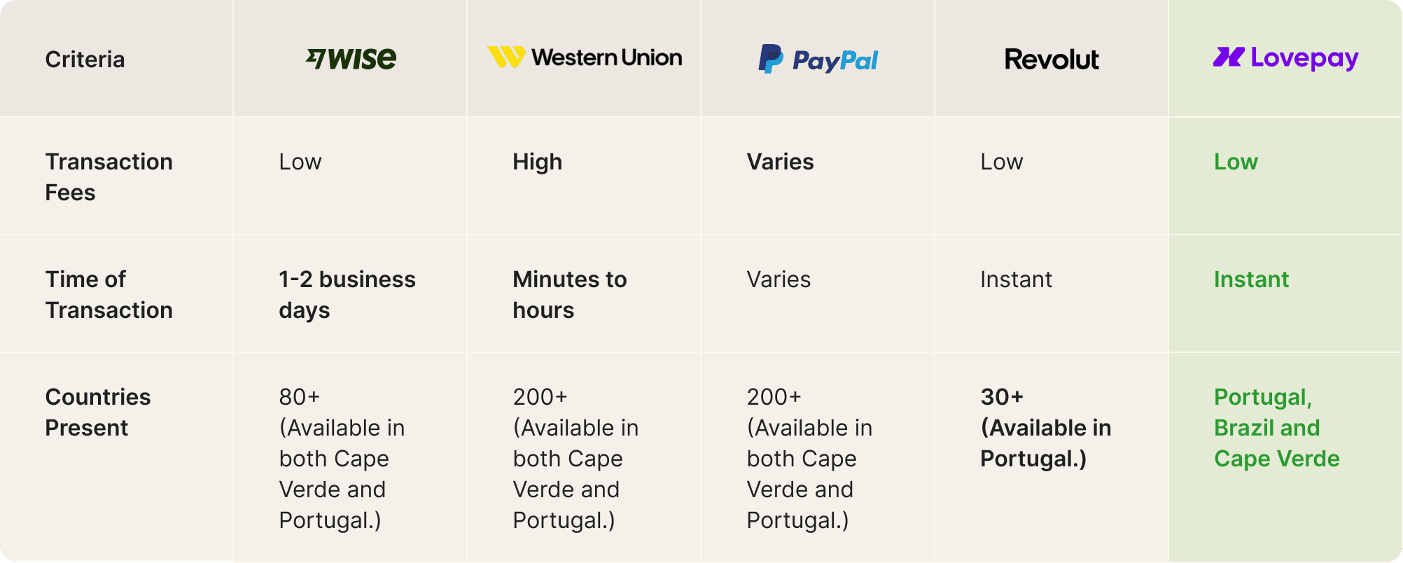
We conducted a competitive analysis of major international transfer channels, evaluating transaction costs, times, and supported countries. None of the competitors offered low fees, instant transfers, and were present in Brazil, Portugal, and Cape Verde.
Our product fills this market gap by offering low fees, instant transfers, and availability in these countries. Additionally, we provide cryptocurrency withdrawals and transfers, giving us a unique advantage.
Benchmark & Inspiration
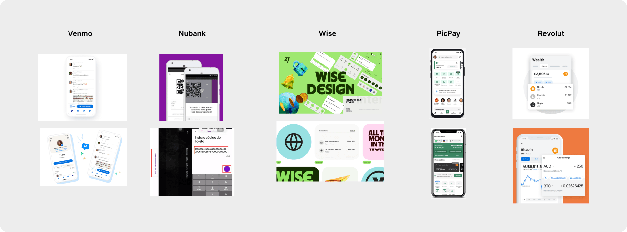
We researched similar apps to understand what works for the competition and see if it fits our proposal, in terms os specific features.
- Venmo (US only): Social features
- Nubank (Brazil only): Boleto payments, QR code, User Interface, UX writing, clear flow
- Wise: Design system, Product website
- PicPay (Brazil only): Wide range of features and use cases, User Interface
- Revolut: Crypto wallets
Business Goals
The business team had clear objectives and made several requests to us, most of them to fix bugs in the old app to improve the experience in the new one. This balance between advocating for the user and listening to stakeholders is essential for evaluating the product's success.
Increase user numbers, engagement, and retain existing users
Enhance social focus
Expand cryptocurrency options and wallet variety
User Goals Based on Personas
Affordable and reliable transfers to family/friends or for personal expenses while traveling
Ease of conversion and withdrawal/Converts financial aid received in cUSD to local currency for daily use
Efficient and cost-effective transactions to manage investments
Design Process
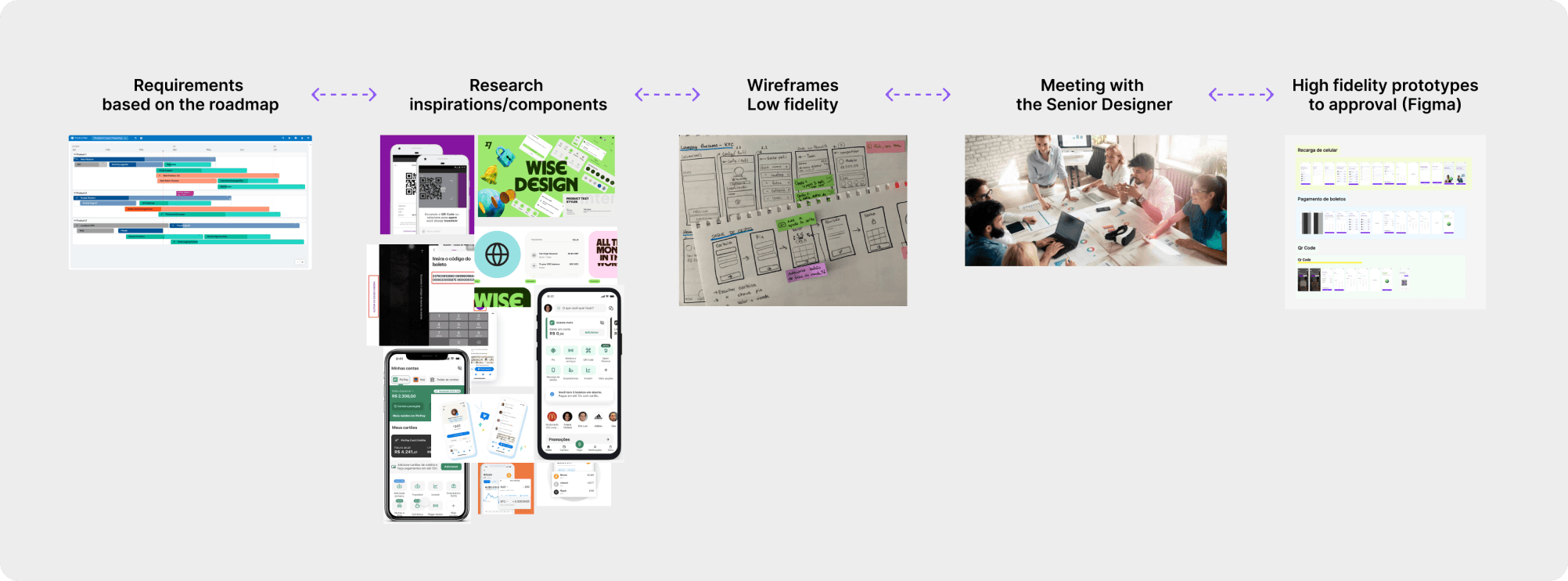
My design process was based on the demands and deadlines set by the business team and prioritized by the senior designer. We worked from a roadmap, prioritizing features and activities that changed according to stakeholder objectives, so it wasn't linear.
Without time and budget for user tests, I started by researching successful products/services with similar goals. I evaluated usability and heuristics, adapting these choices into low-fidelity paper prototypes. I presented these to the senior designer as potential solutions. During our meetings, we identified areas for improvement and aligned objectives.
I then made corrections to the paper prototypes, noted what needed to be added or removed, and created high-fidelity prototypes in Figma, always getting approval before involving the development team. Sometimes, I worked on more than one product and had to switch projects to meet new demands.

If I could do it again... 🧠
If I could have done something differently, it would be improving the documentation of all these processes. Working on multiple projects simultaneously in a fast-paced environment often meant I didn't document important stages and moments in project development. I had to spend a lot of time developing this case study, recalling processes, and documenting them afterward. Tracking our processes is an excellent tool for improving and optimizing our work as designers.
What: Converge in solutions that work
Presenting Final Solutions: Prioritizing and Implementing Ideas to Solve the Problems
Tools:
High Fidelity Prototypes
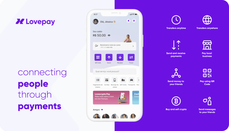
Our final product is an international transfer app with low fees and fast transfer speeds between Brazil, Portugal, and Cape Verde. To achieve this, we focus on making key app features prominent and easily accessible to users (using thumbzones and CTAs). Additionally, we enhance the social aspect by adding messaging options and a friends' activity feed on the homepage. Lovepay has also retained its existing users with the crypto withdrawal feature, which we've optimized by increasing the number of supported currencies and creating a dedicated page for wallets and investments.
As I mentioned earlier, we worked based on a roadmap. I received demands, problems, and requirements and worked on them with my supervisor. To present the final solution, I divided it into specific problems and solutions, following the project timeline.
1. Rebranding for Better Audience Connection and Clear Communication
❌ Problem: The current branding does not effectively connect with our audience or clearly communicate the app's value.
✅ Solution: The senior designer and I redesigned the color palette,
typography, and other branding elements. We also created a brand guideline
to guide the team and future collaborators on the value, tone
of voice, and communication strategy to better resonate with our audience
and clearly convey the app's new value proposition.
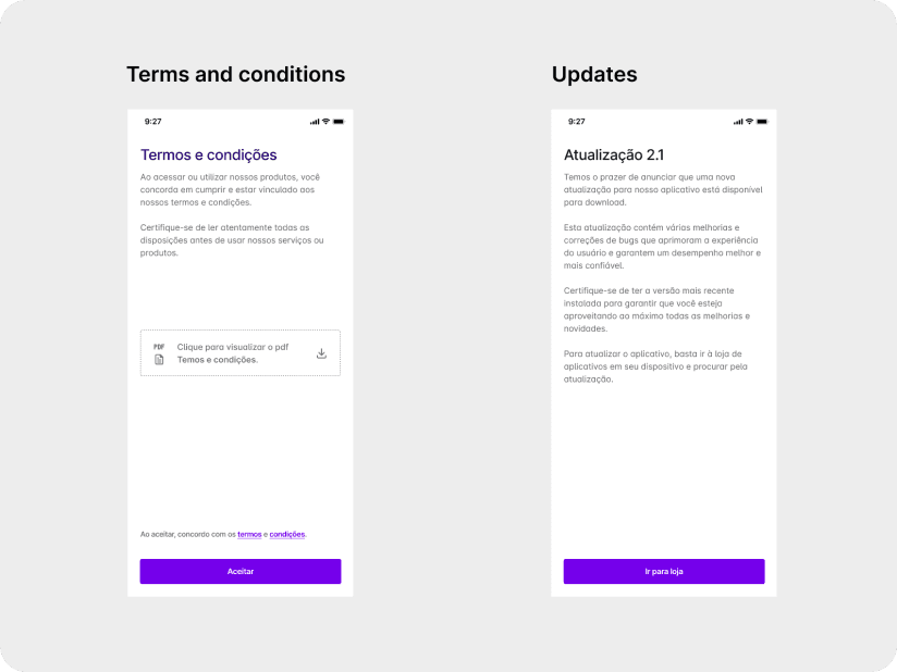
2. Informing Users About Updates: Terms and Conditions and App Updates
❌ Problem: Users are not fully informed about the updated terms and conditions and the new app features.
✅ Solution: We created screens for updated terms and conditions and app listings in stores, so existing
users can download the new app aware of the changes. We included a PDF download option to facilitate
access to the terms and conditions. For the update, the screen shows the user the new proposition
of the app, explains what's going to be different, and includes a CTA directing the user to the App Store.
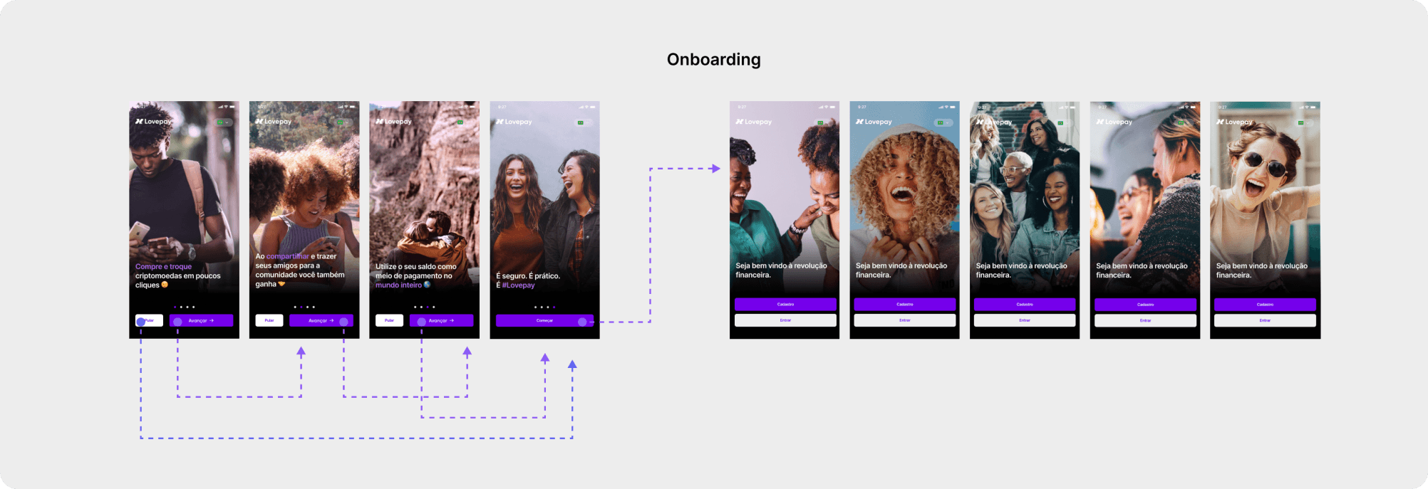
3. Improving User Awareness Through Onboarding Redesign
❌ Problem: New and existing users are not fully aware of the app's new features and how they align with our brand.
✅ Solution: I updated the onboarding process to showcase the app's new features, using photos that highlight
our brand and connect with our audience.
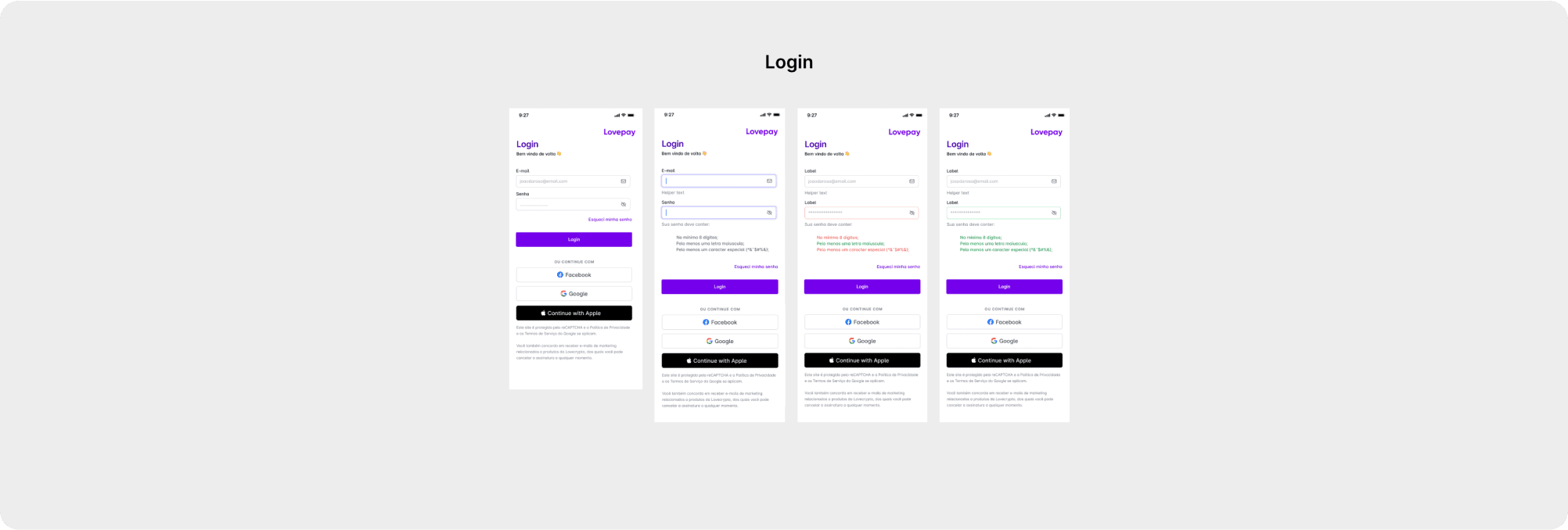
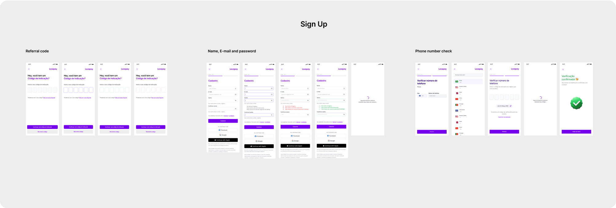
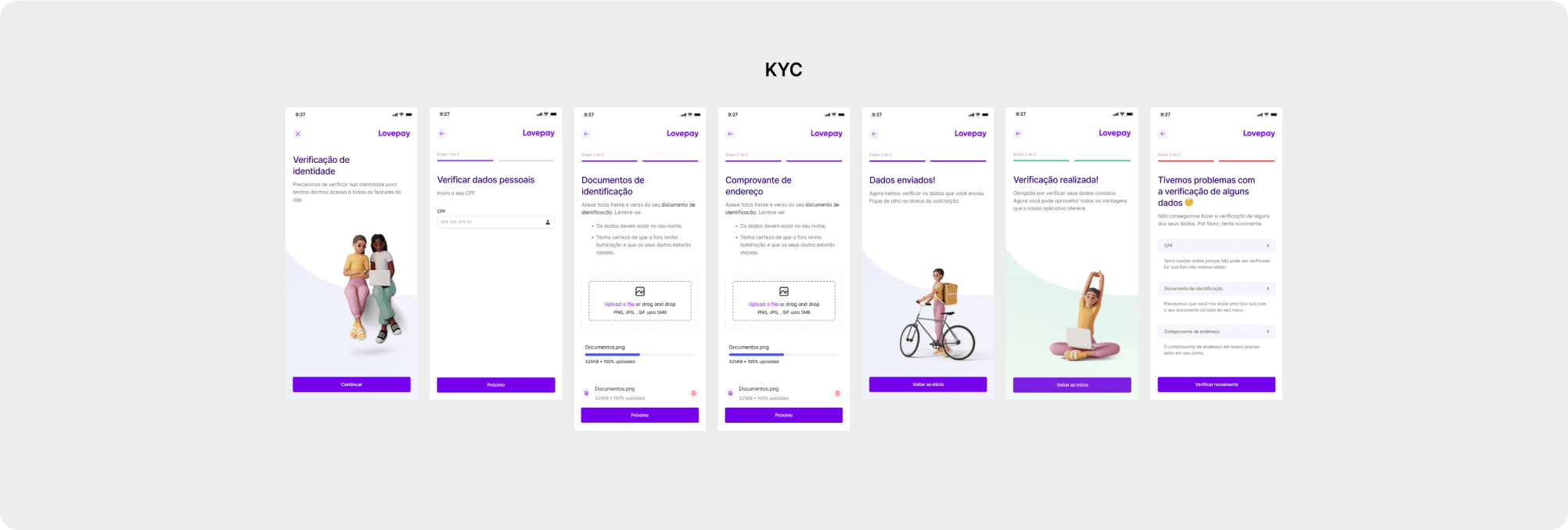
4. Login, Sign Up and KYC: Simplifying the Process
❌ Problem: Login, Sign up and KYC process inefficiencies. Users were experiencing difficulty navigating
and understanding the process, leading to frustration and errors.
✅ Solution: We enhanced the process by introducing color indicators (green for success and red for errors),
along with clear error messages to guide users. Additionally, progress bars were incorporated to indicate
where users are in the process. To streamline development time, we utilized components from the
previous application for input components. We've also added Google, Apple and Facebook
login/signup buttons (using the appropriate guidelines) to make the process easier.
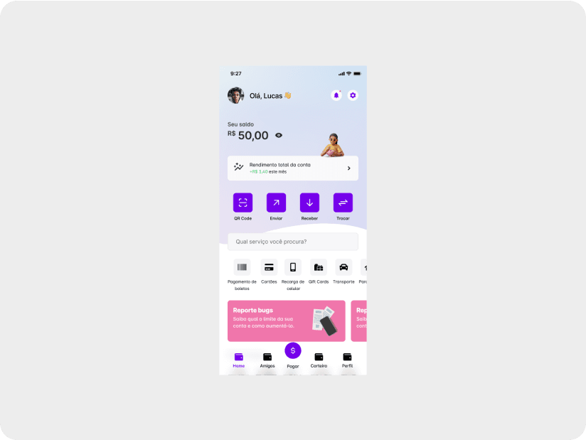
5. Enhancing User Experience: Revamping Homepage and Menu with Key Features
❌ Problem: The homepage and menu lack key features, making it difficult for users to navigate and access
important functions. The old app only had basic features, primarily focusing on withdrawals.
✅ Solution: We addressed this by adding the main app features (send, receive, exchange, scan QR code)
to the homepage and main menu, tailored to the needs of our personas and stakeholders.
Additionally, we highlighted the account balance and monthly earnings, catering to users
interested in investments, one of our new target audiences. We
also adapted the app's new brand elements, incorporating elements from the updated brand guidelines.
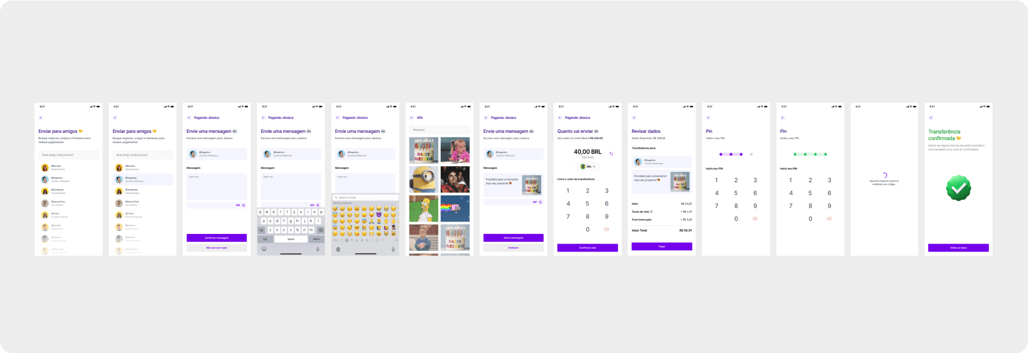
6. Enhance Social Focus: Introducing Messages, Emojis, and GIFs
❌ Problem: The primary goal of our app is to facilitate instant payments to friends and family worldwide.
However, most of existing interfaces lacked personalization elements, making the payment experience
impersonal and less engaging for users.
✅ Solution: To address this, we introduced features to customize the payment experience, such as the option
to add a message alongside the transfer, additional emojis, and GIFs. We also organized a clear and intuitive
flow to ensure the process is fast yet allows users to review all information before finalizing the transaction.
This solution enhances user engagement and satisfaction while maintaining efficiency in the payment process.
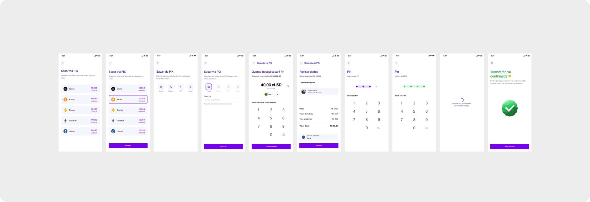
7. Aligning Withdrawal Flow With New Branding Guidelines for Donation Conversion and Long-Term Users
❌ Problem: Stakeholders requested the retention of existing users on the platform, particularly low-income
beneficiaries who received donations in crypto and converted them within the app for withdrawal.
However, the existing app flow and components did not align with the new branding guidelines,
causing potential user disengagement.
✅ Solution: To address this, we reorganized the app flow and adjusted the components to adhere to the new
branding guidelines. This ensured continuity for existing users while maintaining alignment with the
updated brand identity, thereby enhancing user retention and satisfaction.
8. Boosting User Engagement: Introducing Convenient Payment Solutions
❌ Problem: Poor user engagement and limitations in making payments were hindering the app's effectiveness.
Users were not engaging frequently, and payment options were limited, impacting overall user satisfaction.
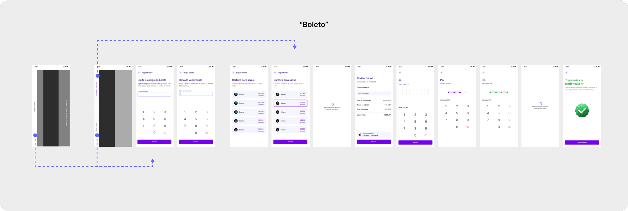
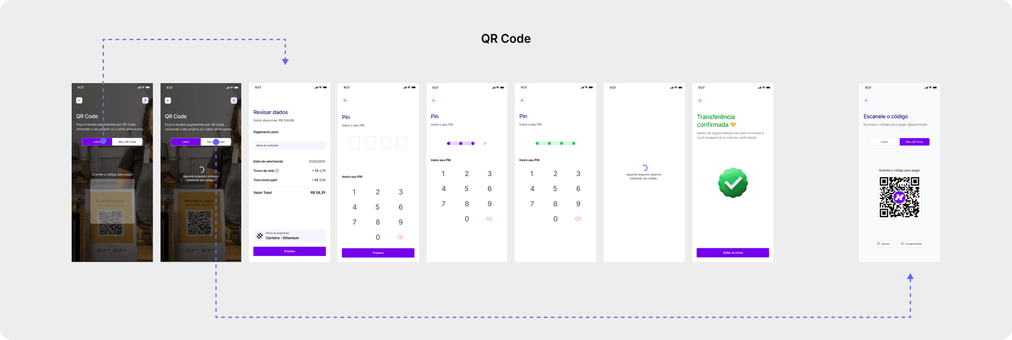
✅ Solution: To address this, we introduced two features: ”boleto” (it is a type of payment method used
in Brazil) payment functionality, allowing users to pay bills, and QR code payments. Users can now scan
QR codes with their device or generate their own QR codes to receive payments from other app users.
This solution simplifies the payment process and encourages more frequent app usage.
9. Answering Stakeholder Requests: Enhancing Social Engagement Inspired by Venmo
❌ Problem: Stakeholders requested increased social appeal within the app to enhance engagement on the platform.
However, the app lacked prominent social features, hindering user interaction and connection.
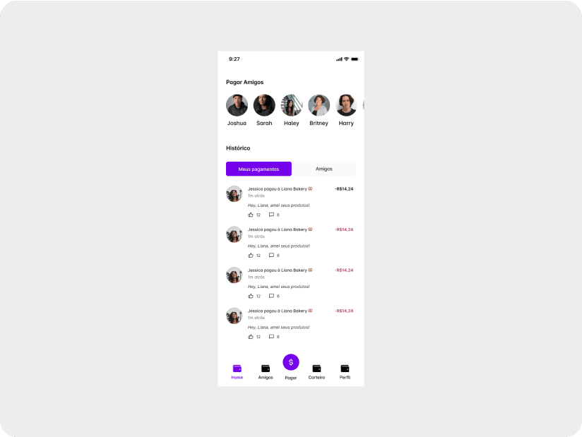
✅ Solution: To address this, we created a feed displaying social interactions on the homepage and implemented
a selection of favorite friends for easy transfer initiation. Our main inspiration was Venmo, a popular
social payments app. These additions fostered a more social and engaging experience for users, aligning
with stakeholder expectations and improving platform usage.
10. Introducing Request for Withdrawal Limit Increase
❌ Problem: As the largest group of users on the app were donation beneficiaries, the daily withdrawal limit
was low. However, with the new app, our goal is to attract new users who transact larger sums of money.
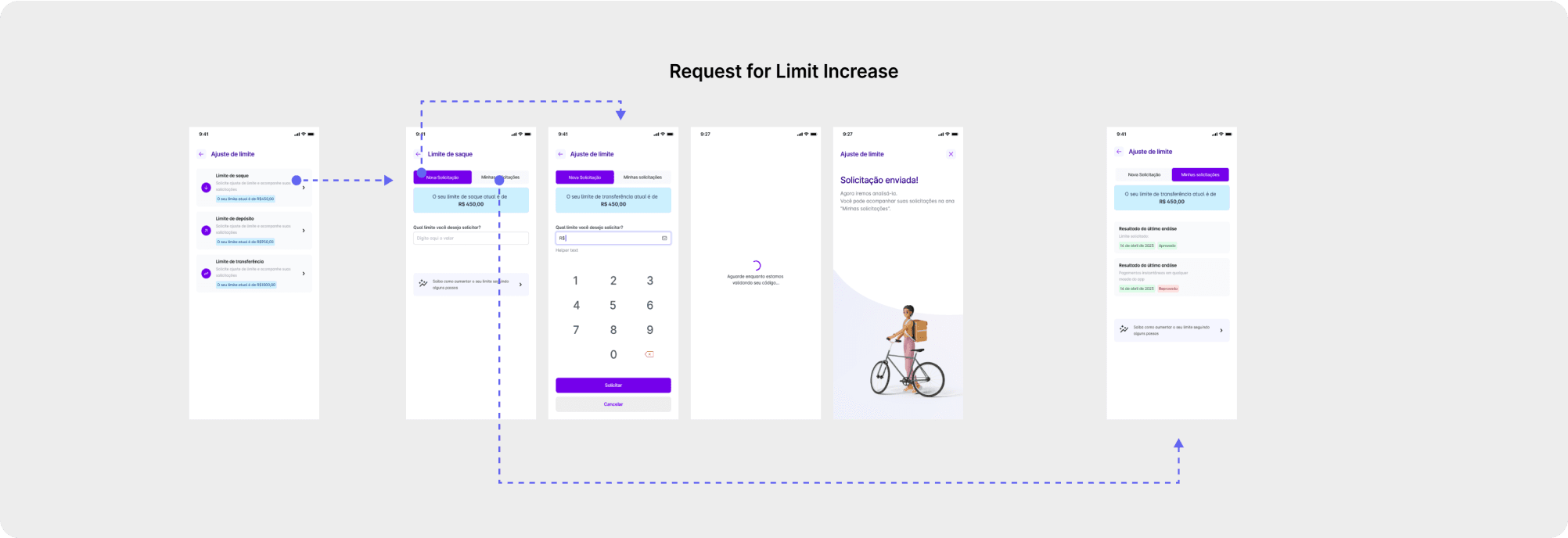
✅ Solution: To achieve this, we introduced a new feature allowing users to request an increase in their
withdrawal limit. This empowers users to access higher withdrawal limits, facilitating larger transactions
and accommodating the needs of users who engage in more significant financial activities.
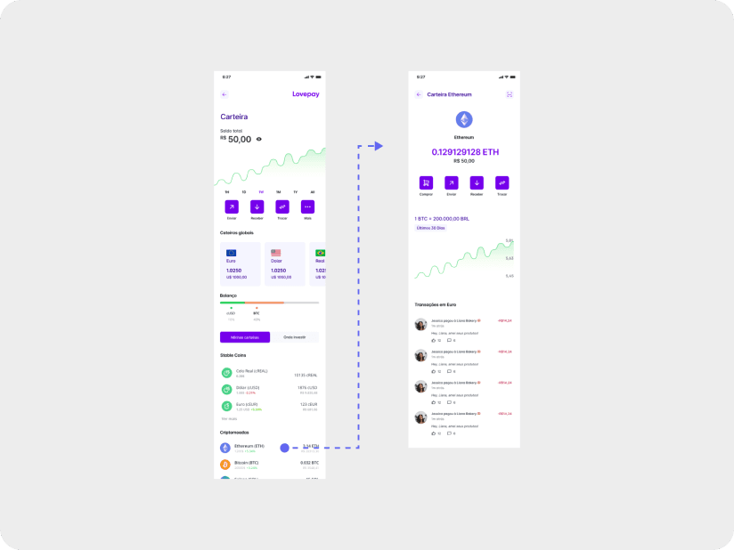
11. Expand Cryptocurrency Options and Wallet Variety
❌ Problem: The old app started as a tool for converting crypto into local currencies for withdrawal, but this
functionality shouldn't be the main focus anymore. Stakeholders requested to retain old users and attract
a new audience interested in crypto investments by offering more coins and investment wallets.
✅ Solution: We developed a comprehensive interface featuring investment visualization graphs and global
currency and crypto quotes, allowing users to track their investments effectively.
12. Improving User Retention Through Enhanced Referral, KYC Integration and Progress Tracking
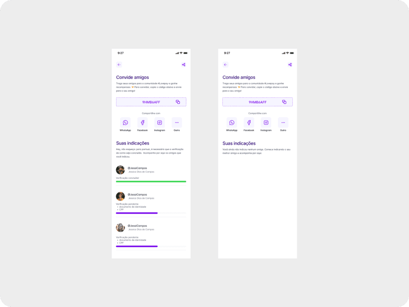
❌ Problem: The old app had a referral system where users would use the referral code to get the cash gift
and then abandon the app.
✅ Solution: We added a rule that users must complete the KYC (Know Your Customer) process before receiving
the reward. This ensures they are ready for transactions that require KYC, making it easier for them to
continue using the app. Additionally, we added a feature where users can track their referrals and see
their progress bars, showing what steps are left to complete the process. This benefits both the referrer and
the referred user, as both receive rewards.
Outcomes & Learnings
Tools:
Self-design critique
Outcomes
Brand guideline improving consistency between different channels (Social media, mobile app, website and visual assets)
Refined the existing design system and created several components from scratch in Figma. (I’d like to apologize to my colleague Lucas for all the times I didn’t use auto-layout and named components like a toddler playing with crayons!)
Maintained the free version of the tool (Figma) to stay within budget constraints.
Learnings
We didn’t launch the product as planned due to legal issues with using cryptocurrency in Cape Verde and problems getting the app approved on iOS. These challenges show how important it is for designers to have varied experiences early in their careers. It's essential for the team to share the same vision for the product, and following design guidelines like Material Design and Human Interface Guidelines is very helpful in overcoming these obstacles.
Different Country, different legislation
Product vision needs to be aligned among all team members
Design guidelines (Material Design & Human Interface Guidelines) are gold

A Big Thanks to the Lovecrypto Inc. Team
This case study is a brief summary of my journey as a UX Design Intern and later as a Junior UX Designer. I would like to thank the entire Lovecrypto team for trusting me and allowing me to have my first professional experience in an environment that taught me a lot and helped me grow as a professional. I wish them all the success in the world. 💜
Other projects I worked on during my time at Lovecrypto Inc.
I worked on various projects and tasks, such as an internal dashboard and the company's corporate website. I plan to publish a case study about them soon, but for now, you can visit them on Behance.
Similar Projects
Design Playground: Daily UI Adventures
Follow along as I practice my design skills with the #DailyUI challenge, exploring new ideas and improving my creativity every day.

Beyond the Clouds: Identifying and Addressing Aviation Industry Issues - A Work in Progress
Please note that this is an ongoing project that aims to explore the challenges of the aviation industry.